


How to Mix Skin Tone Paint for Natural-Looking Portraits
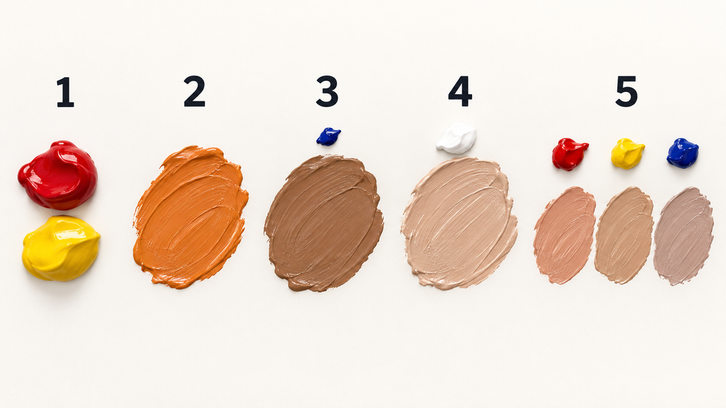
Learning how to mix skin tone paint is less about finding one perfect formula and more about controlling three things: value, temperature, and saturation. A dependable starting method is to combine red and yellow into an orange, then add blue little by little until the mixture becomes a natural brown. From there, use white or the white of the paper to lighten it, and adjust the mixture with tiny amounts of red, yellow, blue, or an earth color.
There is no single “skin color.” Every complexion contains warmer and cooler passages, and the same face changes under sunlight, indoor lighting, and reflected color from clothing or walls. This guide gives you a practical system for mixing light, medium, and deep skin tones without reducing them to rigid recipes.
The Quickest Beginner Method
If you want to begin with a small palette, set out red, yellow, blue, and white. I recommend mixing with a palette knife at first because it makes it easier to see the proportions and keeps your brush from carrying hidden color into the mixture.
- Mix red and yellow to create a muted orange.
- Add a pinhead-sized amount of blue to neutralize the orange into brown.
- Compare that brown with your reference before adding white.
- Add white gradually for a lighter value, or make a darker companion mixture with more blue, red, or an earth brown.
- Correct the undertone with tiny additions: yellow for golden warmth, red for rosy warmth, and blue for a cooler or more neutral appearance.
This is a starting point, not a universal ratio. Different pigments have different tinting strengths, opacity, and undertones, which is why the color-mixing exercises from GOLDEN Artist Colors emphasize observing the behavior of the actual paints on your palette.
Understand Value, Undertone, and Saturation
A skin-tone mixture becomes much easier to diagnose when you stop asking only whether the color is “too light” or “too dark.” Check its value, undertone, and saturation separately. That simple habit prevents random corrections that waste paint.
Value
Value is how light or dark a color appears. Squint at your reference, or view both the reference and your painted swatch in grayscale, to judge value without being distracted by hue. If the value is wrong, even an accurate undertone can look unconvincing.
Undertone and temperature
Undertone describes the subtle color direction beneath the overall brown or beige. A mixture may lean golden, peach, red, olive, neutral, or cool, while temperature describes whether it feels warmer or cooler relative to nearby colors. Treat these as relationships within the portrait instead of labels permanently attached to a person.
Saturation
Saturation is the intensity or purity of a color. Skin mixtures are usually less saturated than paint squeezed directly from a tube, but neutralizing too aggressively can produce gray, lifeless results. Add a complementary or balancing color in very small amounts and stop often to test a swatch.

Skin Colour Mixing Chart
The chart below is a set of correction directions rather than exact formulas. Start with small amounts because strong blues, reds, and blacks can overpower a mixture quickly.
| What you see in the mixture | What to try | Why it helps |
|---|---|---|
| Too orange | Add a tiny amount of blue | Blue neutralizes orange |
| Too pink or red | Add a little yellow, green, or a yellow-brown | It shifts or neutralizes excess red |
| Too yellow | Add a small amount of red-violet or blue-violet | It reduces the yellow cast |
| Too gray | Restore a little red or yellow | Warm color can return lost chroma |
| Too dark | Add white in opaque media; use more water or reserved paper in watercolor | It raises the value |
| Too pale or chalky | Mix a stronger mid-tone separately, then combine it gradually | It restores color without another large dose of white |
| Too warm | Add a controlled touch of blue or cool brown | It lowers the temperature |
| Too cool | Add yellow ochre, burnt sienna, red, or yellow | It increases warmth |
Do not make every area of a face from one base color plus white or black. Prepare a small family of related colors instead: a light, a middle value, a dark, a warm modifier, and a cool modifier. Oil Painters of America’s simplified skin-tone mixing method likewise demonstrates the usefulness of keeping warm and cool colors available around a foundation mixture.

Colors to Mix for Light, Medium, and Deep Skin Tones
The same color theory can cover a wide range of complexions, but the most efficient starting mixture may change. Always compare your paint with a well-lit reference rather than relying on a category name.
Light skin tones
Begin with yellow and red, neutralize the orange carefully with blue, and then add white. If the result becomes candy pink, introduce yellow ochre or a speck of green-blue. If it becomes chalky, mix a more saturated orange-brown separately and fold a small amount back into it.
White has strong influence, particularly titanium white, so add it in stages. GOLDEN’s guide distinguishes strong opaque white used for pronounced tints from more transparent white suited to subtle changes, a useful reminder that the specific white affects the result.
Medium skin tones
An orange-brown made from yellow ochre, red, and blue is a flexible foundation. Burnt sienna can make the process faster, but it still needs adjustment because a single earth color cannot supply all the warm, cool, light, and shadow notes in a face.
Create the middle value first, then mix one warmer version and one cooler, darker version beside it. Keeping those piles related makes the portrait feel unified while still allowing natural variation.
Deep skin tones
Start with enough color strength to preserve richness. Burnt umber or burnt sienna combined with ultramarine blue can establish a deep neutral, while red, yellow ochre, violet, or another blue can shift its temperature. Add white only when you actually need a lighter opaque passage because too much can cool and desaturate the mixture.
Deep complexions still contain clear changes in value. Look for reflected light and subtle temperature shifts rather than making shadows uniformly black or highlights uniformly beige. A useful watercolor example shows how brown, blue, sienna, red, yellow, and violet can create diverse skin mixtures, with water controlling depth in that transparent medium.

How to Make Skin Colour by Mixing Two Colours
If you have only two colors, burnt sienna and ultramarine blue are one of the most versatile pairs. Burnt sienna supplies orange-red warmth, while ultramarine cools and darkens it; varying the balance produces warm browns, cool browns, and near-neutrals. Add the surface white in transparent watercolor, or include white as a third paint when you need light opaque mixtures.
Other useful pairs include yellow ochre with a violet, or an orange with a blue. The exact outcome depends on the pigments, so two tubes with similar color names may behave differently. Make a small graduated strip before starting the portrait: begin with mostly the warmer color at one end and increase the cooler color step by step.
This two-color approach is excellent for learning temperature control, but it has limits. A restricted pair may not reach every rosy, golden, olive, or violet note visible in a subject, so add another pigment when the reference genuinely requires it.
Mixing Skin Tones With Acrylic Paint
Acrylic is convenient for practice because it cleans up with water while wet and allows quick layering. Its fast drying also means that a carefully mixed edge can set before you finish blending, so mix enough paint, keep your palette organized, and work in manageable sections.
Some acrylic mixtures appear darker after drying because the milky-looking wet binder becomes clear. This effect is explained in GOLDEN’s technical discussion of acrylic color shift and in Winsor & Newton’s guide to acrylic drying time and color change. Let a test swatch dry before committing to a large facial area.
For smoother transitions, you can use a manufacturer-approved glazing or slow-drying medium according to its directions. Do not keep adding large amounts of water or improvised additives, since excessive dilution or the wrong additive can affect handling and the dried paint film.

How the Method Changes for Oil, Watercolor, and Gouache
The color logic remains the same across media, but the way you control value and transparency changes. Testing your mixtures in the actual medium is more reliable than copying a chart made with a different kind of paint.
Oil paint
Oil stays workable longer than standard acrylic, making soft transitions easier to blend. Mix several value steps before painting and keep clean portions of your warm and cool modifiers available. Each oil pigment has its own undertone, transparency, and tinting strength; Gamblin notes these differences across its artist oil color range.
Watercolor
In watercolor, preserve the white paper for the lightest areas and vary the amount of water to control value. A wash often dries lighter than it looks when wet, so test it on a scrap of the same paper and allow it to dry before deciding that it needs another layer.
Gouache
Gouache permits opaque light mixtures, but colors may look different when dry. Make enough of an important base color, record your rough proportions, and check a dry swatch. Repeatedly scrubbing a passage can reactivate lower layers, so use deliberate strokes once the mixture is right.
How to Make Skin Colour Without White
You can mix convincing middle and dark skin colors without white by combining transparent or semi-transparent reds, yellows, blues, and earth colors. To create a lighter appearance, apply a thinner layer so more of a light ground shows through, or place a lighter-valued yellow or earth color beside the mixture. This works naturally in watercolor and can be used through glazing in acrylic or oil.
Without white, however, you cannot always reach the same high-value opaque tint. Do not treat that as a failure of color mixing; it is a limitation of the available pigments and technique. Reserve the light surface from the start when working transparently.
Mix a Family of Portrait Colors, Not One Flat Shade
Once your base is close, observe the smaller shifts across the subject. Areas with more visible blood flow may appear warmer, while planes turned away from a warm light may appear cooler. Reflected light can introduce color from a shirt, wall, or nearby object, so the correct mixture depends on the whole scene.
Before painting details, make five connected piles:
- A general middle value that matches the largest skin area
- A lighter mixture that is not simply pure white
- A dark mixture that preserves color
- A warmer red, orange, or yellow variation
- A cooler blue, violet, or green variation
Use these as parents for smaller mixtures. This keeps you from chasing every tiny color change with a completely unrelated recipe and makes corrections easier.

Common Skin Colour Paint Mixing Mistakes
Adding too much white too early
White raises value but can also reduce saturation and change temperature. Match the darker base first, then take a small portion aside and lighten that portion. This preserves the original mixture and gives you an easy way back if the light color becomes chalky.
Using black as the only shadow color
Black is not forbidden, but it is powerful and can flatten a mixture when used without attention to temperature. Try a chromatic dark made from blue and brown, or blue with red and yellow, then compare it with the reference. If black is appropriate for your palette, introduce it in tiny amounts.
Mixing directly on an uncalibrated screen
Phone and monitor brightness can make a reference look lighter, cooler, or more saturated than it is. Lower excessive screen brightness, turn off strong color filters, and, when possible, work from a properly lit printed reference or the live subject.
Correcting a large pile all at once
If a mixture is close, move a small portion aside before changing it. Test the correction there first. This saves paint and lets you compare the original with the adjustment instead of relying on memory.
Treating a premixed flesh color as complete
A premixed color can be a convenient starting point, but it still needs value and temperature variations. No single tube can represent the changes created by anatomy, light, surroundings, and individual complexion.
A Simple Practice Exercise
Choose a clear portrait reference with one dominant light source. Paint or draw a small value study first, then mix the colors; separating those tasks helps you see whether a problem comes from value or hue.
- Mix one observed middle skin value.
- Divide it into five small piles.
- Keep one unchanged, lighten one, darken one, warm one, and cool one.
- Paint five labeled swatches and let them dry fully.
- Use the swatches to make a small portrait study with no detail smaller than the width of your brush.
- Record the pigment names and approximate proportions for future reference.
Repeat the exercise with references under different lighting. You will learn more from comparing your own dry swatches than from memorizing a universal ratio that may not work with your paints.
When your session is finished, clean water-based paint promptly rather than reaching for harsh solvents on your hands. This guide to removing paint stains from skin safely explains practical cleanup options for different kinds of paint. For children, classrooms, or anyone concerned about material safety, check product labels and look for evaluated products through the Art and Creative Materials Institute’s certification program.
Frequently Asked Questions
What colors do you mix to make a skin tone?
Red, yellow, and blue can produce a brown base that you can adjust into many skin tones. Add white for lighter opaque values, or use the white paper and more water in transparent watercolor. Earth colors such as burnt sienna, burnt umber, and yellow ochre can make the process faster but are not mandatory.
How do you make skin colour by mixing two colours?
Try burnt sienna and ultramarine blue, adjusting the ratio toward warmth or coolness. Orange and blue or yellow ochre and violet can also create useful neutrals, but a two-color palette may need white or a light ground to reach pale values.
Is there a reliable skin colour mixing chart ratio?
No single ratio works with every paint because pigments vary in strength, transparency, and undertone. Use a chart as a direction guide, then build a mixing string with small measured steps and label the exact tubes you used.
How do you make light skin colour with acrylic paint?
Mix a warm orange from yellow and red, neutralize it with a very small amount of blue, and gradually add white. If it looks too pink, add a touch of yellow ochre or green-blue; if it looks chalky, restore a little of the stronger orange-brown base.
Can you mix skin colour without white?
Yes, especially for middle and deep values or transparent painting. Thin the paint or use watercolor so the light ground raises the apparent value, but remember that you may need white pigment to create a very light, opaque tint.
Why does my skin-tone mixture look muddy?
You may have added too much of a complementary color, mixed too many pigments, or contaminated the mixture with a dirty brush. Start a fresh small pile, make one correction at a time, and keep separate tools or clean them before moving between warm and cool colors.
Should skin-tone shadows be mixed with black?
They can include black, but black is not the only option and is easy to overuse. A mixture of blue and brown, or all three primaries biased toward blue and red, often creates a dark that retains more temperature variation.
Conclusion
The most dependable answer to how to mix skin tone paint is to begin with a balanced brown, match the value, identify the undertone, and make small corrections. Build a family of related highlights, middle values, warm notes, cool notes, and shadows rather than trying to stretch one flat beige across an entire portrait.
Start with a five-swatch exercise before your next portrait and keep the dried chart beside your palette. If you want more practical art, color, and everyday how-to guidance, explore the latest tutorials on Story Prior and save your successful mixtures for the next painting session.